Blog
We love design; it’s what we do and it drives us to nurture the partnerships we have with our clients. We believe that listening is critical, process is key, collaboration is vital, and that design is a valuable contribution to the world of business, art, and culture. The 21xdesign blog features anything from discussing recent projects, exploring antique books we love, to the technologies that drive our profession.
Our latest X

Thanks to Mitzie Testani for submitting this very cool X as part of the 21Xhibit call for entries. Mitzie shot this while visiting New York and was intrigued by this unusual X. IF you’d like to see some of her design work, you can click here. You can also check out her great photography on Flickr by going here. And once again, if you’d like to submit an X, your image must be 5.5 x 5.5 inches, RGB in 300 dpi. We’ll post all the entries as they are submitted. By the end of the year, we’ll pick the best 21 submissions, and the great part is...
read moreA new X

Here’s the latest X for our 21Xhibit call for entries. This X is from Steve Decusatis. Thanks Steve! You can also check out Steve’s work. And remember, in case you missed our earlier post, if you’d like to be a part of this, we’re looking for a few good X’s. Twenty one of them, to be exact. So, if you feel like being creative this summer, send us your X. It can be a photograph, an illustration, or a typographic image. Really, we’re open to anything, so long as it relates to the letter X. Your image must be 5.5 x 5.5 inches, RGB in 300 dpi....
read moreOur first X!

Mike McDonald sent us the first X for 21Xhibit. It’s pretty cool, check it out. As we get more entries, we’ll post them here, and eventually to our Flickr account. Check out Mike’s cool work here.
read more21Xhibit 2013

We’re looking for a few good X’s. Twenty one of them, to be exact. So, if you feel like being creative this summer, send us your X. It can be a photograph, an illustration, or a typographic image. Really, we’re open to anything, so long as it relates to the letter X. Your image must be 5.5 x 5.5 inches, RGB in 300 dpi. We’ll post all the entries as they are submitted. By the end of the summer 2013, we’ll pick the best 21 submissions, and the great part is we’ll print up the top 21 X’s in a nifty little book with your name in it. Each of the...
read moreSmokes by Design #2
Check out a few more nifty boxes below. Really nice use of halftone dots in a couple of...
read moreThe Farming Life
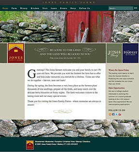
We launched the Jones Family Farm website in Dec ’09. What an interesting place – this family owned and operated farm/business has been in operation for 150 years. It’s 400 acres is in a charming setting and takes me back to my summers in the west of Ireland. You can feel the history and character of the area when you walk around the farm and look across its stone walls into the valley. Made me feel like putting on me wellies and muckin in! More at – http://www.jonesfamilyfarms.com/
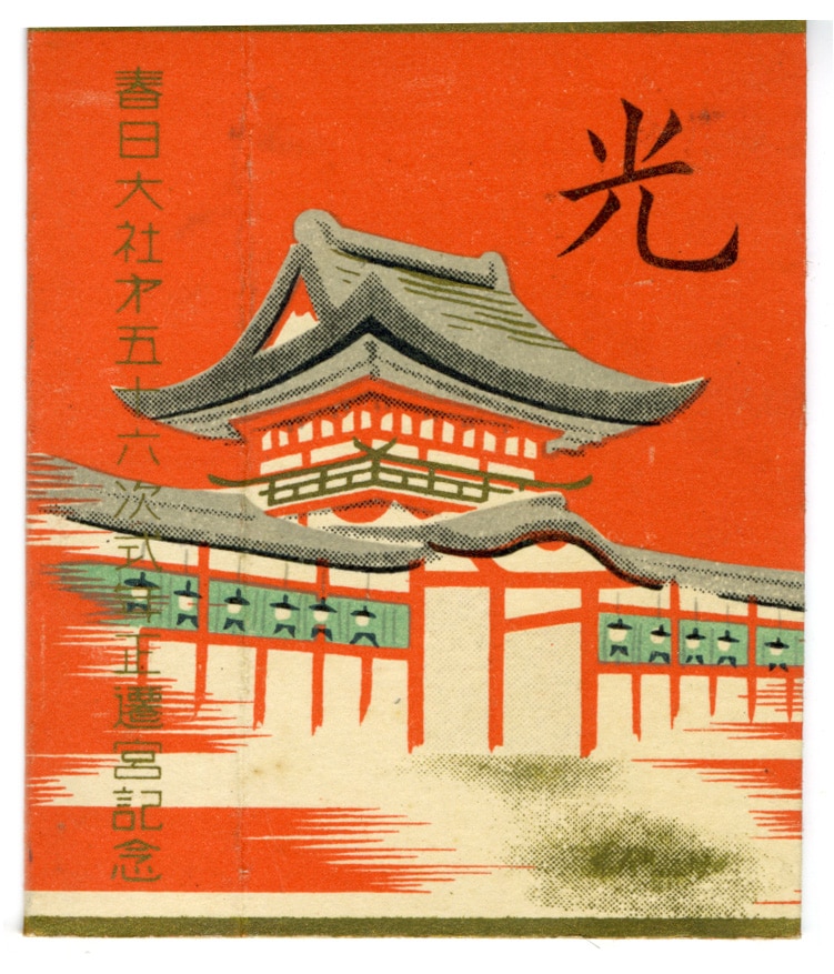
read moreSmokes by Design
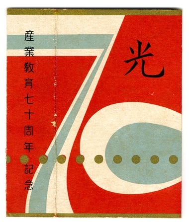
We picked these post WWII era cigarette boxes in a great flea market in Tokyo. The boxes only measure 1.75” x 2.75”. The boxes have an array of wonderful designs. We will feature a selection of our collection on an ongoing basis in this blog so check...
read more
Maybe you can’t judge a book by its cover
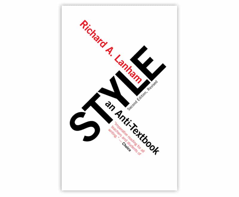
Shown here is a recent book cover we designed for Paul Dry Books in Philadelphia. “Style an Anti-Textbook,” by Richard Lanham is a book that regards writing as “pleasure rather than duty.” It’s basically an antidote to your typical, boring classroom book on how to write “well.” We thought that this “revolutionary” approach to writing lent itself to this typographic treatment inspired, of course, by Russian Constructivism. But I guess, having the title and this typographic, constructivist inspired cover, could also mean that it’s...
read moreA time gone by
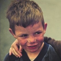
We have been looking through our archives and found a lost world – a selection of images taken in the early 80′s in Dublin. These pictures give a glimpse into the character of an old area of the city that has been forever changed by time and the impact of world social-economic changes. If you would like to see more of these images let us know. See more images here.
read more